Project overview
Context
Wool4School is an annual fashion design competition organised by The Woolmark Company for students from grades 7 to 12. Each year there is a new competition theme or topic. They are inspired to design an original outfit made from Australian Merino wool.
The website is an information hub of resources to be used during the competition as well a platform for participants to register and submit their entries.
My role
- UX/UI Designer: conducting user research and delivering UX artefacts as well as UI elements and templates.
- Collaborative work with external UX and development team.
Original problem
- The look and feel of the site seemed dated and isolated from all the other campaigns promoted by The Woolmark Company.
Users/audience
- Year 7-12 Students. 95% female
- Design and Technology Teachers
The design process
I followed a user centric design approach to define a clear value proposition from the start. The process was based on three main stages; discovery, analysis and design were prototyping and testing were carried throughout.
Discovery/current website
- Content audit: working closely with the project manager we put together a document listing the current content inlcuding videos and fact sheets available for users.
- Heuristic analysis: based on the knowledge I have working in previous Wool4School competitions.
Discovery/user research
Qualitative Research
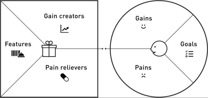
I wanted to gain a deeper knowledge of our users, their behaiviour and pain points, so I used the value proposition canvas to map out the different components as described below.
- Conducting contextual enquiries with students. These findings were one of the most insightful ones. Navigation issues were discovered due to the way most of the content was categorised.
- Another clear pattern can be found where a few people reported some difficulty following the competition guidelines if they were entering individually and not as part of a class. The use of the website requires guidance through its contents so students could find relevant information easily but it is not that effective when the student is working by their own.
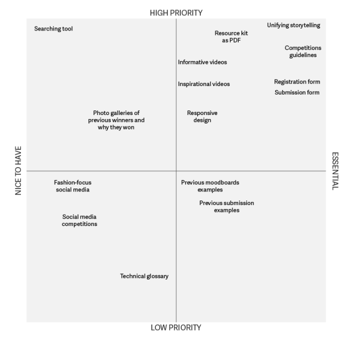
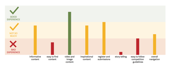
The results of this part of the research were captured in this diagram to prioritise what features do we need to focus on.
Three user goals were clearly defined after analysing the value proposition canvas. User wanted to know what the competition is about, get some sources of inspiration like stories from previous winners and videos from fashion designers and they wanted to know about the properties of wool in fashion.
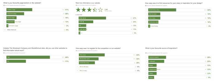
Quantitative Research
- Over 30 Students and teachers surveyed (the survey was created in Typeform)
- Analytics assessment (Google Analytics)
- Searching behaviour and external audit report analysis
The overall user experience
Reframing the problem
At this point of the design process I could articulate a redefined problem based on the insights I collected from students and teachers.
The website contains lots of useful information, but students found it difficult to access it, as well as navigating and completing esential tasks. The problem was bigger than just the need to change the UI and overall look and feel of the competition for it to be more useful and inspirational.
HMW:
Some key questions were asked in the HMW format to put users goals in context:
As students, how might we…
- quickly find information on how to design using Merino wool?
- get inspired to use wool in our designs?
- participate in future competitions?
- know what a winner outfit look like?
As teacher, how might we…
- get practical resources to use in our classrooms?
- register my class for the next competition?
- know when do we need to submit our designs?
Redefined objective:
- Create a new content structure that translates into a navigation that allows browsing information easily for both students and teachers.
Information Architecture (IA)
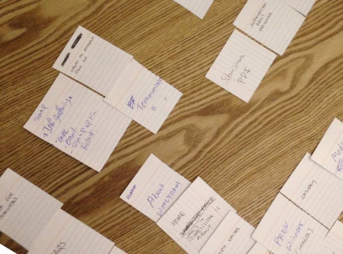
Ontology
Labeling and naming pages and sections with a clear descriptive vocabulary for every piece of content that is available on the website.
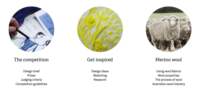
Example: The ‘Inspiration’ page will host stories related to the Australian wool industry as well as content on innovative ideas and design techniques.
Taxonomy
By defining a clear hierarchy, every piece of content can be grouped according to a meaningful logic order by topic of interest.
Example: The ‘Washing Wool Made Easy’ video is available on the ‘Wool Properties’ page which is part of the ‘Merino Wool’ section at the top-level navigation.
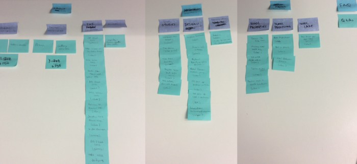
Choreography
Relating content to other pieces within the website is key to generate engagement and cohesion when trying to convey an idea or to expand on a related topic of interest.
Example: This is the case of the ‘You may also like’ section at the bottom of most of the pages in the website.
This section suggest relates topics to the user, based on what it is available to explore in other pages. It generates a natural interaction with the content and allows a progressive disclosure of information.
Content Strategy
After reviewing some ideas on how the Information Architecture could be established, the content strategy soon follows to fill the gaps users were experimenting when trying to find information and to help achieve the business goals.
New content was created to tailor users needs being this the case of the ‘Past competitions’ page where we will give each of the previous overall winners a space dedicated to their design process and a gallery with their wining garments and its features.
In the same way, the ‘Judging Criteria’ was extracted from the resources section to a more predominant place due to its importance for participants to outline one of the key parameters of the competition.
Storytelling experience
As well as the creation and restructuring of content, there is a key element that will define the core of the user experience. This is the need of implementing a storytelling experience to convey an interesting message to new participants based on the stories of former competition winners.
These stories will generate more engagement throughout the different stages of the competition and create a scenario for students to relate to.
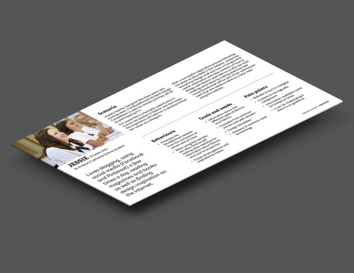
Personas
Personas were defined based on the user research and additional documentation provided by the project managers about feedback and comments from participants of past competitions.
- Primary personas: Years 7-12 Students. 95% female
- Secondary personas: Design and Technology Teachers
Criteria:
- Scenarios
- Behaviours
- Goals and needs
- Pain points
This gave us the context in which the students normally interact with our website, under what circumstances and what their motivations and frustrations are.
Wireframes
Primarily conceived for desktop functionality following a mobile-first methodology. Every element present in the layout is essential and has a practical purpose to be there.
High-level wireframes were printed in a large format and displayed in a prominent place for the entire team to visualise the entire structure of the site, make comments and possible changes keeping everyone on the same page. This poster was updated weekly over the time we worked on wireframing and content strategy.


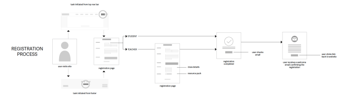
User flows and tasks
Define task and map-out key user touch points. Here is an example:
Prototype
A working prototype was later created in InVision which was the base for further testing and iterations.
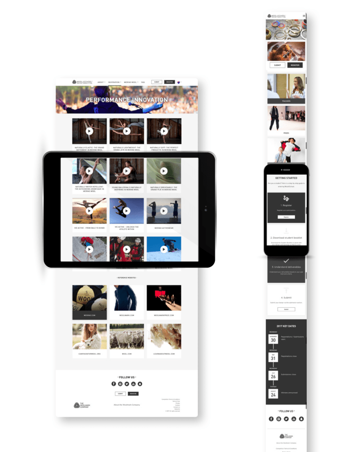
UI Design
Desktop
Different design concepts, layouts and colour palettes were considered before the final version. They were validated and tested out by users during usability tests.

Tablet and mobile
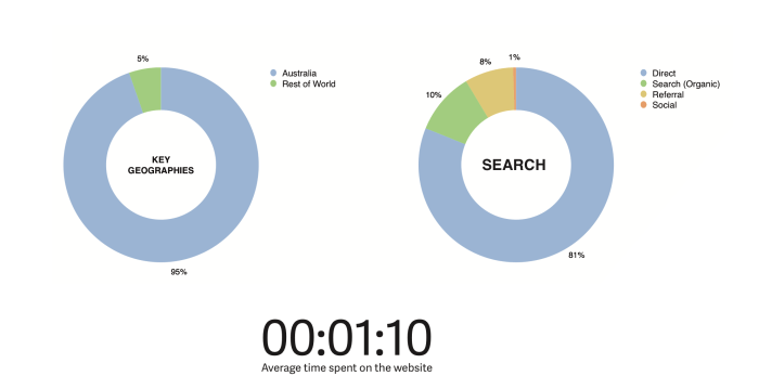
A responsive design was considered from the beginning of the project even though the research showed that 75% of users access the website via desktop, 16% prefer a tablet and only 9% use their phones.
Outcome
The website was redesigned from the ground up. A redeveloped IA shaped the new UI creating a better user experience that is also aligned with the business’ goals. As a result, student registrations into the competition went up by 38.5% compared to the number of entries from the year before.
Number of Registrations
- Old website during the 2014/2015 competition: 9,955 registrations
- New website during the 2015/2016 competition: 13,789 registrations
Since the launch of the website, the Wool4School Design Competition is now open for students in Hong Kong and the UK and now the website is available in two languages to cater for the new audience.
