Context
The client was a government agency with a strong online presence informing and serving the general public. Considering it is a government institution, the organisation is required to comply with Level AA of the Web Content Accessibility Guidelines (WCAG) 2.0 to ensure the all members of society, including people with disabilities, can access to the information they provide.
My role
- UX Researcher: Design test cases and scenarios, conduct usability sessions, analyse data and present insights back to key stakeholders.
- Accessibility specialist: Documenting design recommendations based on Level AA analysis of WCAG 2.0 standards
Deliverables
The full report included:
- Most relevant insights based on user behaviour
- Summary of passed and failed WCAG 2.0 criteria
- Detailed and actionable recommendations and fixes for designers and developers based on WCAG 2.0 standards
The test
Objective
By testing the site with the help of a diverse group of users, the client wanted to understand how accessible their website was. As a result, the client could implement the necessary changes towards a more inclusive digital experience for all their users.
Participants
- 8 vision impaired people – screen reader users
- 8 people with motor disabilities – keyboard-only users
- 8 deaf users
- 8 people with cognitive disabilities (dyslexia) – no assistive technology required
Test scope
The site was tested in both desktop and mobile devices.
Assistive technology used:
-
- Desktop: JAWS / NVDA screen readers (Windows).
- Desktop: Keyboard-only
- Desktop and mobile: closed captions for videos
- Mobile: Talkback (Android) and Voice Over (iOS) screen readers. Users used their own devices.
The set up
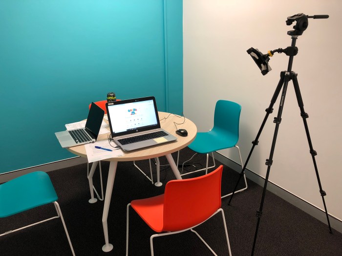
Both groups of participants, mobile and desktop, were asked to sit on the orange chair. The tripod was holding a camera which recorded the entire session.
During the desktop test, the camera pointed to the screen to capture the click-behaviour as well as to the keyboard to capture its use. For the mobile test, the camera had to be repositioned depending on the participant so it pointed to the mobile in their hands.
It is worth noting that participants were asked to use their own mobiles phones. This is a great strategy, particularly when testing for accessibility, as it is guaranteed that users feel more comfortable using their own devices so the session will flow more naturally as they don’t need to spend time setting up a foreign device. For example, a user had a braille sticker on her mobile screen, which is of great help for her when typing. If we would have used our own devices, the test would have been very challenging for her.
This aspect was considered from the recruitment stage as it is always best to have a good mix of both Android and iOS users.
Results
Testing a site with the help of such a diverse range of users allowed me to validate certain assumptions and uncover new usability issues. Usability for accessibility meant that the implementation of research insights will improve the experience not only of users with disabilities but, by extension, the overall experience for all potential users.
How do we achieve that? Testing with participants with cognitive disabilities should be a common practice among accessibility testing, in the same way, we test our sites with screen readers. It brings a new perspective to the overall study.
As an example during this test, users with dyslexia experienced a high degree of difficulty and frustration navigating through certain sections of the website because some buttons were not clearly depicted as such. As a result, most of the participants couldn’t complete the task. It was then recommended to implement better button labels and improve its visual representation and placement within the layout of the page.
Making these subtle changes will not only improve the experience for these group of users but it will benefit all audiences. Those tasks that used to take more time and were hard to complete, now requires a lower cognitive overload for everyone, even if they don’t have a cognitive disability.
