Context
The Company
The Woolmark Company owns more than twenty different brands. Some of which are used to undertake marketing campaigns and R&D within the global textile and fashion industries to drive demand for wool, others are licensing brands that provide consumers with an assurance of quality.
Initial brief
The brief was to create a concept for a training app to facilitate the use of the different brands and digital assets, such as logos and campaign collateral, for staff members across the organisation. I was initially involved to create the wireframes and UI elements based on a pre-defined information architecture.
I started by asking ‘why’ and it soon became apparent to the entire team that we needed a tool that could offer us more versatility than what an iOS app could.
At that stage, I was assigned to lead and project manage the research and design components to find out what the user needs were and how could we align these with the business goals in an effort to design the most effective solution.
Users/Audience
- Primary: Staff – includes HQ and overseas offices
- Secondary: External parties only by invitation from staff member
My role
- UX/UI Designer: I was in charge of the user search and testing as well as the ideation, prototype, and UI design.
- Product manager: I also managed the executions of the research process, design and front-end deliverables and worked closely with the Delivery Manager/ Analyst, the System Engineer and overseas developers during the entire project.
Deliverables
I was in charged of the execution of the following phases and artefacts;
- User research:
- Facilitate user and stakeholder interviews— discovered how staff use brand assets on a daily basis as well as identifying key problems and pain points
- Remote usability testing— moderated screen sharing session with international participants.
- Data collection and analysis
2. IA and navigation design
3. Wireframes
4. UI elements and visual design
Objective
Consolidate The Woolmark Company’s brand guidelines portal where employees and external parties could access and download brand assets and relevant information when working on a particular campaign, event or partnership.
The design process
I implemented a combination of user-centred design processes to reframe the original problem and discover user needs and business goals that were not considered up to this point.

Discover/Empathise
By taking the original brief apart, we could segment different elements as follows:
- Digital tool
- Internal staff globally
- Brand usage selection
- Assisting and guidance
- Self explanatory
- The Woolmark Company (TWC) and Woolmark (WM) brands
- Use for specific situations
- Training tool (The brief pointed to create an app)
- Key account managers and project managers
- External parties (creative agencies, contractors, freelancers, brand partners)
Primary research:
- Stakeholder interviews: the 5 Why’s technique was very useful to discover what the real goals of the business were at this point. Below are the responses from one of the interviews.
Q: Why do we need an app?
A: So staff members can access the latest information about our brand guidelines wherever they go and to train new staff on the use of our diverse range of brands.
Q: Why do they need to view this information on the go?
A: Because they could be at a trade show, at an event with a brand partner or at their offices talking to someone who needs to use our brand assets if they are organising an event or campaign.
Q: Why do they need to look for this information?
A: Our brands can be used in many forms depending what the purpose of the event or campaign is and this can be confusing at times.
Q: Why is this confusing for them?
A: Because we recently went through a brand redevelopment and there are old assets that are still being used and there is no way for us to control it.
Q: Why they don’t know what assets to use?
A: Because there are so many guidelines in PDF form all over the place with information that is sometimes obsolete or contradicting.
- Staff members interviews and contextual enquiries: this exercise allowed me to identify what kind of tools and processes they are currently using to source brand assets and logo guidelines. Also, it gave me the first look into their day-to-day way of work which made the stakeholders realised that staff doesn’t normally use iPads or iPhones when they are gathering brand assets for their campaigns and events. In fact, the use of mobile devices to do this kind of work is reduced to just a few people in particular events.
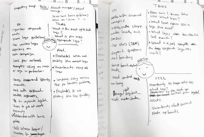
- Empathy maps: based on what I gathered so far I drafted two maps to understand what the users do, think and feel when working with brand assets and design guidelines.
Secondary research:
- Heuristics: an analysis based on what I have experienced working with our different brands and guidelines.
- IA created by project manager: I took this original IA to challenge it and validate it based on what we have discovered up to this point.
- Other desk research: learning how all the assets are stored internally using various tools (e.g. shared drive, Dropbox folders, local drives, etc).
Define/ Reframing the original problem
Insights:
- There is a need to differentiate two key users within the primary audience; general staff and site administrator.
- The current brand guidelines are scattered in several PDFs.
- Brand logos are stored in many locations.
- The is no integration of brand assets with the current DAM system.
- There isn’t an up-to-date brand book that unifies all our corporate and campaigns logos.
- There is no clear consensus about brand guidelines.
- Lack of control and monitoring over logo usage for a particular campaign, event or promotional material.
HMW:
-
As users, how might we…?
A. Access brand guidelines and download assets from a single place.
B. View example of previous campaign artwork.
C. Share assets with colleagues and external contacts as requested. -
As an administrator, how might we…?
A. View what logos are downloaded by whom and for what purpose.
B. Be able to update content as required.
C. Centralise brand asset distribution using the current DAM system.
D. Monitor and communicate logo requests with stakeholders.
Final brief:
Build a web application that consolidates The Woolmark Company’s brand guidelines into a single destination where employees and external parties could access brand assets and relevant information when working on a particular campaign, event or partnership.
Develop/Ideation
The content strategy

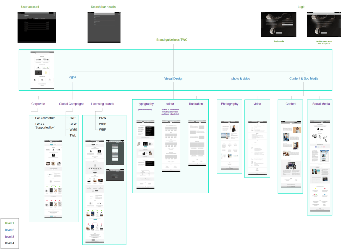
Once I narrowed down the main problem, I started to work upon the original IA that was given by the project manager. This was a great starting point as the diagram kept changing while defining the content strategy with stakeholders and copywriters.
Content and page audit:
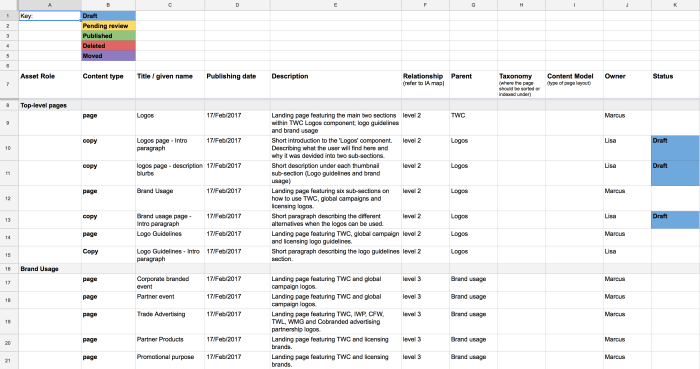
I prepared a simple Google Sheet that was viewed by the entire team so we all could see what kind of content was needed, who was responsible for it and to keep a record of any modifications.
Thanks to this, the content strategy was much easier to do since we could identify what piece of information was missing and what should be removed or categorised under a different page or section.
UI explorations
Preliminary navigation ideas and exploring how to display content based on the redefined IA.


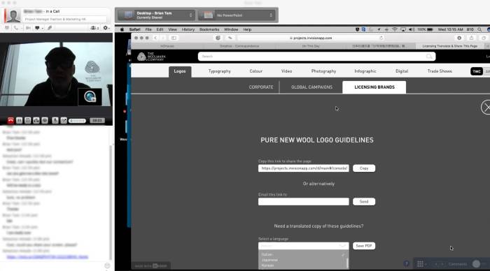
I then created a low-fi prototype in InVision to get a sense of how it all look together.
This initial prototype was used to communicate ideas with developers and stakeholders before proceeding with a more refined version that will be used for our user testing sessions.
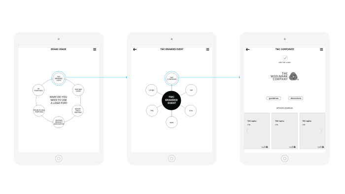
One of the most relevant aspects of this preliminary concept was to show how the main navigation could work. I was exploring a tabbed navigation bar at the top and a secondary side menu on the left.
Develop/Prototype
In this prototype, I started to use real content thanks to the progress we were making on the page audit spreadsheet. These screens were exported from Sketch into InVision where I quickly created a clickable mockup of some of the main sections of our website.
To be able to use the full width of the page and to comply with some technical requirements from our developers, I implemented a drop-down menu within the top navigation bar instead of moving forward with the sidebar from the previous low-fi prototype.
Before I started the usability sessions with selected staff members from our different offices, I refined the prototype as seen in this interactive mockup.
Usability testing
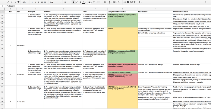
One week before the test, I wrote the tasks I wanted the participants to complete and with the help of the project assistant we planned the sessions over the following two weeks. We sent out invitations to our participants giving them some context and an overview of the exercise as well as the tools we will be using during the test.
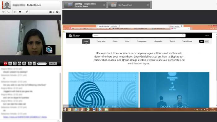
Considering that the majority of users are located in our regional offices around the globe, we contacted key members in China, Hong Kong, Korea, India, UK, USA, Italy and Japan to run a series of remote moderated tests. We used both GoToMeeting and Skype which allowed us full session recording and screen control sharing.
Two groups of users were tested. The first one using the original design concept and the second with the revised design based on findings from the first group.
In both sessions, I started by giving some context of what we are doing and mentioned that we are not testing them but the design of the interface. Also, I asked them to think aloud while going through the task. I encouraged them to give any feedback and comments at the end of the session as I told them that I won’t be able to answer any questions during the task.
Then I proceeded to read a scenario I created earlier and a task for them to complete. Here is an example of these:
User goal: Solve questions about brand usage
Scenario: You are planning an advertising campaign on a trade magazine to promote The Woolmark Company in your region and would like to see some existing pieces of artwork to know how the corporate logo has been used in the past. Since the ad will be created by the creative team of the publication they might require the appropriate logo guidelines for this job.
Task: Find some artwork examples of previous trade ads as well as the relevant logo guidelines to brief the creative team.
It is worth noting that I planned the sessions so I read tasks following a counterbalanced technique, from session to session, to make sure I don’t get similar completion times and answers if users already got used to some elements of the UI, making it look easier for them to complete the second task.
I also created a Google Sheet to record the scenarios, tasks and completion times and comments from me and users that will come after each session. This way I could go back to these findings and share the relevant information with stakeholders and developers between the two group sessions.
Key findings & pivotal moment in the design process
- Once we finished the first round of usability tests, it was apparent to us that there was a major problem in how some content was categorised since we noticed that most participants were expecting to find certain information in other places which took all of them an excessive time to complete a particular task.
- We were using certain labels and vocabulary to name some sections of the website that were used by the team in Head Office but not widely used by our staff in the overseas offices.
- If we were to make some minor changes at this point, that could translate in less development time and better use of the website.
Based on this new information, I decided to make some structural changes in the IA. I went back to Sketch and created a simpler site map that responded to what we have learnt from users up to this point and reflected these modifications in the prototype.
These changes helped users navigate the site much faster and completing a task in less time, compared to the first group of participants. Thanks to this, we knew we made a good decision by spending some more time working on the UI before proceeding with the second part of the usability test.
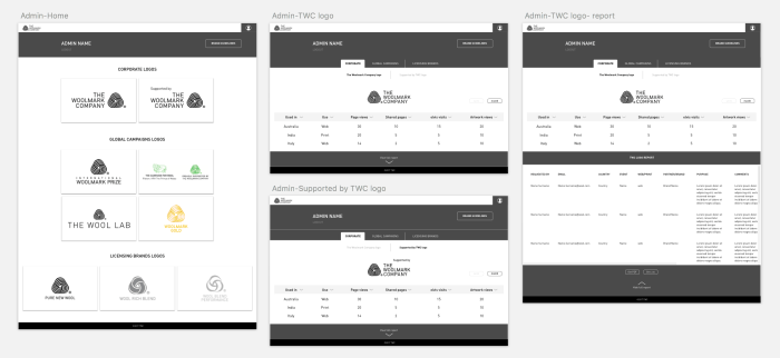
I also ran a couple of moderated usability tests in Head Office based on iterations from previous sessions to validate some assumptions particularly within the design of the administrator dashboard and login screens.
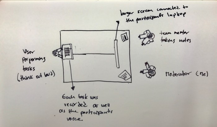
We set up a laptop for the participant on the left, connected to a bigger screen to mirror the user’s monitor. The project assistant was always present in these session taking notes so we could discuss at the end of the test.
Deliver/Prototype and test
The final UI
By this point, I was confident we could move forward to the development phase of the process after several iterations during the UI design.
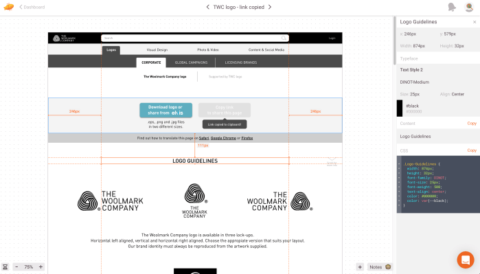
I used Zeplin to import the final high-fidelity screens for our developers to use. This was a simple way to communicate designs, provide design assets, and build out design specifications.
The outcome
The Woolmark Company Branding Portal is the central location for staff to access and share branding assets and guidelines internally and with third parties if required.
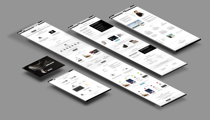
Desktop
Mobile
Retrospective
The beginning of the process is a great opportunity to gather the entire team and stakeholders to define roles and responsibilities, as well as to discuss what and how the solution will be built. A clear project scope was the result of such discussions which helped greatly to define deliverables, technical specifications and design expectations.
We faced different types of challenges along the way. Change of requirements, budget and deadlines, talent selection, among others. Following the initial project scope and promoting communication and active participation from every team member was the key to overcoming these hurdles.
